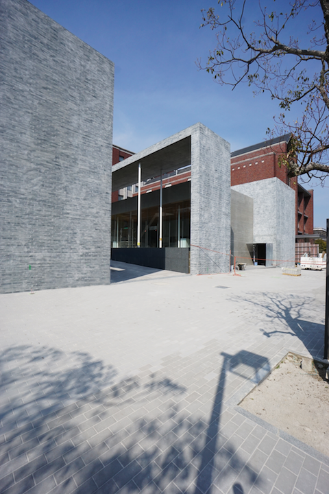
27 August 2015

New Website Launch!

0 Comment


Facet Studio has a new website!
Our blog has also moved...

We have made it easier to navigate, with better / bigger images, more helpful to our work, and moved the blog in together so you only need to visit one place.

We hope you like our new look on the internet – enjoy!

20 March 2015

Doshisha obtained Occupational Certificate!

0 Comment
During the past week there have been several authority inspections and defect inspection from us happening at Doshisha.
We have successfully obtained Occupational Certificate from Kyoto Council on MAR 19 - this formally marks the completion milestone of the project.

What is now left are documentation of as-built building for record purpose, and finalising paperwork with Doshisha University.... a little bit of breather after the climax va-va-voom.

A glimpse of the past few days:

Fire department briefing in the morning before inspection

Rooftop equipment safety inspection

Lift inspection...

Weights used to test lift loading

Our Kyoto office....  All these mockups, of ceiling (right top), of wall tiles (back)...and perspectives on the wall...even original competition entry plan is on the wall.
I was asked the question at an interview: "How do you feel when the finished project looks different from your design?"
My answer was: "But it always looks just like how we designed! That is the reason we are involved, to build what we designed, what we promised; we don't design something that can not be built.  And that feels great to see it coming to life."

14 March 2015

Spring coming

0 Comment

春風に吹き出し笑う花もがな - 松尾芭蕉
Spring winds  
Hoping the flowers burst out in laughter
- Basho Matsuo


I can not wait for Spring to arrive at Doshisha.

3 March 2015

愛着 - Attachment to construction site

0 Comment
I like the moment towards end of construction, when everyone has spent a good portion of their lives on site that there is a certain fondness and closeness to what they do and where they are.

Little gestures like taking shoes off rather than stumping around in construction boots, paying attention to small areas without being told to.. I found those very touching, and it is not cultural but rather universal. Of course there is the less romantic take of "dun wanna scratch da paint off" but that is no fun is it.

Doshisha is in the 13th month from its construction commencement.  Unbelievable.

largely finished student lounge, such beautiful light...
...someone in there fixing up the ceiling...

....with little "socks" on the bottom of the ladder 

tiling for water feature finished....

.... with neat stone "collars" to protect the bottom of steel columns, their grouts aligned whether or not anyone would see that after the water is in

entry canopies to buildings are installed, contrasting to the weight of the building volumes these are of sleek steel members....

... to look "light" the fixing needs to be neatly concealed....

...beneath precisely cut stone tiles

lighting up student lounge (lucky future students!)...

...but remember to take your shoes off!

1 March 2015

Wu-Gu and Chinese high tea

0 Comment
Bonus of working on designs for restaurants - delicious ones especially - is exposure where we do not normally get as architects.

Wu-Gu was featured on Daily Telegraph on Sunday (for their delicious food), with interesting description of the space:

...the fitout is Chinese tea house gone high-rise .... not a fussy space...

We are never into the "fussy" kind of design so it is not to my surprise, but the tea house (and culture specific) is quite an interesting association which I do not dislike.  It is one which is quiet, serene, almost meditative, but with sweet smell in the air and warmth to the touch of fingertips.


More on making of Wu-Gu HERE
Wu-Gu restaurant official site HERE
Wu-Gu Facebook HERE
The original article HERE


24 February 2015

Finishing Touches

0 Comment
I am always fascinated by the sudden transformation finishes can make to a construction site.

Doshisha is currently in that process of "getting finished"; covering up services, structure, like how our skin covers up our organs and bones.

Here are some photos from site as per yesterday FEB 23:

flooring to Student Lounge side, setting out from facade fins

ceiling to Chapel side (getting speakers and lighting installed too)

junction of inside and outside - water feature to outside getting tiled at the same time

tiling inside wetareas; setting out the 50mm x 50mm mosaic was not fun....

beautiful stones for the water feature

wall panelling to rear of Chapel hall

18 February 2015

100 days of 五穀 Wu-Gu

0 Comment
We have obtained Occupational Certificate for Wu-Gu on the 100th day from the start of construction.
It was opened to family and friends on FEB 15, one fine Sunday afternoon.
Soft opening to public was on FEB 17 evening.

Despite the obstacles, the space was filled with a crisp joy.
It was one of those moments - the "never been happier for not giving up" moment.

Here are some photos from Sunday FEB 15 (photo: Eugene Wu)
Followed by slideshows of the construction.

 the facade.  It is completely openable to create a seamless inside-outside connection during the day, however with the current footpath condition (which is to be paved in a couple of months time) the client is shying off the idea for the time being.

 interesting how tables chairs and tableware can make such a big change in impression...
it was suddenly a restaurant whilst less than 24 hours ago it was a construction site.

  looking back at the entry

 the solid looking facade catches glimpses of street activity.
It was designed to screen out headlights from all directions at night and maintain a level of inside-outside visual connection, to ensure comfort of the patrons.

such lovely festivity, just in time for Chinese New Year celebrations!

on the mezzanine

Love the sense of space and volume

ground level

mezzanine level

11 February 2015

Chapel Side is catching up!

0 Comment
Whilst the Student Lounge Side at Doshisha Chapel Complex is frantically getting ready for the academic staff to move in prior to the official opening to public, the Chapel Side is also steaming to catch up.

This is where we are as per yesterday 2015 FEB 10:

Student Lounge Side - ceiling all installed, marble rear feature wall completed.
Love the delicacy of the ceiling (if I may say so myself...).

Student Lounge Side - academic office starting to take shape

Chapel Side - ceiling half way through installation
Love how the natural light is interacting with the building volumes (IF I may say so myself!!)

Chapel Side - mezzanine to rear of Chapel Hall where the organ will be installed

Chapel Side - inside one of the meeting rooms across from the Chapel Hall mezzanine
Across the roof of entry one can gain visual connection to inside of the Chapel Hall

Chapel Side - entry
Wall tiling completed now moving onto floor tiling; the skylight brings natural light into the darkest spot of the entire complex and highlights the intersection of circulation

28 January 2015

Joint effort

0 Comment
It has been quite emotional to browse through the hundreds of Doshisha site photos coming through the past few weeks.
Now the project is coming closer to wrap up, a lot of the hardwork in the process is evident. It is so nice to see things coming together.

Take this little toilet window as one example.

close up of window.
top and bottom of the window fall in line with the tiles, and there is no tiny off-cut tiles to left and right of the window; it is of course designed to happen this way, not accidental.

The process has roughly been:

1. internal planning to determine window location - Architect 
2. determine exhaust location and dimension - Architect + Mechanical 
3. determine window sizing - Architect + Structural
4. determine surrounding finishing detail - Architect + Supplier
5. custom tile design and tile setout - Architect + Supplier
6. fine-tuning of window location to better suit tile setout - Architect + Structural
7. concrete structure with adequate spacing for necessary window framing parts - Architect + Supplier + Contractor
8. steel reinforcement and concrete pouring - Architect + Contractor
9. opening framing - Architect + Contractor
10. window installation - Architect + Supplier + Contractor
11. exhaust system installation - Architect + Supplier + Contractor
12. tiling - Architect + Contractor

Architect's involvement is not about physically holding the power tool and building something (a common public misconception resulted from reality TV shows..) but to maintain a perspective of the whole project and to ensure each step along the way is carried out to enable the next step to occur according to plan.
Especially when multiple parties (various engineers and trades) are involved, coordination becomes vital as miscommunication is source of disaster.

... And of course there are many more windows and doors and you-name-it to make sure the building functions... 

It is not about the window itself, but about incorporating functional elements in design without distracting the design intension.

It is always about the big picture.

19 January 2015

Last stretch for Wu-Gu! 加油! がんばれー!

0 Comment
For many many many unforeseeable reasons beyond our control, Wu-Gu construction is suffering from extended delay (you do not have a whole day to read and I do not have a whole day to whinge, let's not get into it..).  Now we are seeing light at end of tunnel, at last.

Some lessons I have learnt to date are:
1.
Contract is a formal documentation of human relationships.
Contractual arrangements between all parties (including and definitely not limiting to leasing contract between client and his/ her landlord) have direct impact on people's mentality, which directly influence people's attitude, performance and reliability.
2.
Amount of time spent =/= quality of outcome.
3.
(reinforced) Persistence.

Anyway, let's do look at some nice site photos!

The hoarding came down, this was the first time I have looked at the facade in its entirety.
Was so exciting!

Close up of facade in process.  The window mullions are made of 8mm steel flatbar, designed to be very refined to minimise gaps between facade joinery boxes.

Majority of the facade came flarpacked and was built off-site, they give more depth to the facade.

strong linearity inside the shop

most of internal spatial divisions were also built up by the flatpacked boxes

lights up;
modularity of the boxes extending from inside to the outside is visible; the entire shop was designed with the base unit of the box.

lighting effect from afar