12 November 2010

MMM (M house Mini Me - follow up)

0 Comment
So with the M House huge model, we were checking a few things:

1. effect of natural light in the space.

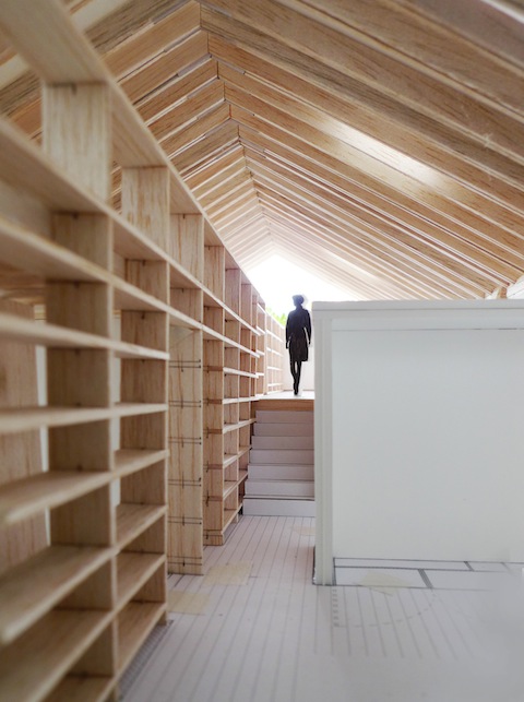
light coming through sky light can be seen reflecting off the roof rafters on the top right.

As the roof rafters are so close together (445mm centre to centre), there is no matching skylight size for a single spacing; we tried the next size up, which is 1.5x spacing, and the next size up which is roughly twice the spacing. Verdict was that the skylight has to have some relationship to the rafter spacing.  The way the natural light bounces off the roof structure was unexpected, but a nice surprise...

Another nice effect (which was designed) is the way the light funnels through the end of the roof structure, the triangular space between the roof geometry and the wall.  It is the negative space of the roof, and because of the presence of natural light, the roof seems to "float" over the wall structure.

at the junction between rafters and wall, we inserted glass instead of simply taking the wall to underside of the roof...this added to the lightness of the roof and further distinguished the roof form; end of rafters can be seen through the opening, which emphasised the sense of extension and stretches the "territory" of the house beyond the actual bounding walls

2. rhythm of the roof structure

the line up of the double rafters
the spacing of the rafters have been changed many times for many reasons.... it was 303mm centre to centre, then went a whole circle, settled on 445mm centre to centre.  The model helped clarifying how the different spacing could impact the space aesthetically.... by the way, as you can see here...the rafters are in fact DOUBLE with a tiny gap to sandwich steel plate at junctions....this goes on for 20 odd meters.......

3. height relationship of building elements

purity of the triangular, negative space between roof and the walls

notionally it is obvious that the triangular negative space should  be kept clear of vertical obstructions...but to what extent?  it becomes a bit of a struggle when we had to put in a powder room on the intermediate floor (to the left of where the person stands in the background), and we were confronted by head-height problem.  If we try to stay under the triangular negative space, someone will hit their head in the powder room for sure.  For a while we kind of left that and attended to other more urgent problems.  After the 1:20 model was built, we had a chance to double check that...and we were right, notionally....

the box to the right of the person (on the other side of the bookshelves) is the powder room. We have roughly 1.6m to work with in head height.

We are now trying to drop the floor locally in the powder room (since we can't go up...) to allow for adequate head height.  It is a difficult decision but when we saw the box sticking above into the triangular negative space......something felt very wrong.

Anyway......another day....another battle.......


11 November 2010

Kicchi kicchi (how organised is organised?)

0 Comment
We have received more material from our builder in Japan last night......

drawings to the left and monthly construction program to the right..... 

last time we received the overall construction program...this one is in so much detail and new one will be issued every month....I mean....EVERY MONTH....

I have to say I am ultimately impressed.  The roles of builders in Japan and in Australia are so different.  In the context of M House, all the drawings we issued for the tender process (let me tell you, there were A LOT!), once we have selected the successful tender (normally tender goes to 3 builders for tender, M House was a little special, we went for 5 builders), the successful builder has taken the time to REDRAW all of our drawings with their in house staff....that way they can be 100% sure of all dimensions and every aspect of the building, and in the process, they also incorporated the structural engineer's specification.

one of the drawings "reproduced" by the builder

Of course the responsibility falls on us to check all their drawings now, to ensure our design intent details are not lost in translation.

.....still very amazed......

10 November 2010

Building mini-me's

0 Comment
Following on from 2 days ago, my question was: "Anyone curious about why we make (huge) models?"

(read about the last entry HERE)

Well it is kind of obvious....it is much cheaper to build the models to check the design before it is built in real!  But  then according to different stages of the process, why do we use different scales (1:1500, 1:500, 1:200, 1:100, 1:50, 1:20, 1:5, 1:1)?

early 1:500 model of Railway Parade (the pen in front shows the physical size of model)

more recent 1:100 model of the rear portion only (orange in 1:500 model)


latest 1:50 study model of Railway Parade (see the size of the pen now...)


The larger scale models, if required, are used to study the building's massing (size, shape etc) in relation to its surrounding context.  How do we know if our building would be too big/ small, and what shape it should take, to make sure it fits well with the existing context?  Other than guidelines given by the authorities such as Local Councils and State Government..... this is where the project starts and by having a large scale model it is easier to see the large picture (...pun unintended...).  Depends on size of project, it may be from 1:200 up to .......(1:5000?)

1:100 and even 1:50 models are more used to understand the spatial quality and interrelationship of the spaces inside and surrounding the building.  Models become more accurate and detailed (because they are large enough to hold that amount of information), and give out a rather accurate study.  We use these models to study the natural lighting condition, design of building elements etc.

At times we do even up to 1:1 study (or prototype) of components, eg for shop fitouts and display units, to understand the junctions, study the lighting effects, and ensure how we have designed will "work" when we put things together physically.  Someone like Renzo Piano makes facade prototypes quite often.

Renzo Piano's original 1:1 prototype of the IBM Pavilion, London, 1983 (photo taken from Renzo Piano Logbook, published by TOTO)

As an example, the cost of making this one single prototype can be easily justified, as the Pavilion was made up of 34 of the same arches - it is far better to find out if anything is to go wrong when you have only made one arch, rather than 34 arches later....

Design and documentation phase is the most economical to test and check design.  It should not be rushed because if things were not thought through thoroughly beforehand (the common "lets think about it when we get there" approach), when issues need to be resolved on site, available options become much less, and of course cost will be less of priority when time becomes of essence.

8 November 2010

Sydney Open 2010

0 Comment
Perfect Sunday today.

view over Sydney Harbour today

It was the last day of Sydney Architecture Festival.  We caught the last event, Sydney Open, and had the opportunity to look at some buildings which are not normally accessible to general public. I would have loved to see some Mid Century modern houses by Harry Seidler and Neville Gruzman if we were a bit more organised... Anyhow, some of the buildings we saw today!

Sydney Masonic Centre - experience of walking up the central staircase was incredible, with the mass and fluidity of off-form concrete from the 70's.. (Joseland Filling, 1974; tower completion: 2004)

Sydney Masonic Centre (Joseland Filling, 1974; tower completion: 2004)

Hyde Park Barracks - top floor exposed original roof structure above corridor between the convicts rooms.  There is something pure about the way the roof structure relates to the walls (Francis Greenway, 1819; UNESCO World Heritage listed 2010)

Hyde Park Barracks (Francis Greenway, 1819; UNESCO World Heritage listed 2010)

Hyde Park Barracks - landscape wall which I believe was reconfigured from the original by rebuilding a portion of the wall to open up a view window to and from outside (Francis Greenway, 1819; UNESCO World Heritage listed 2010)

The Mint (Architect unknown, 1816; new building: FJMT, 2004)

Duetsch Bank Place (Foster+Partners, 2005)

7 November 2010

Luce Memorial Chapel - I M Pei

0 Comment
When chatting over Friday drinks in the office, we were reminded by one of our staffs who graduated from Tunghai University, Taiwan, of this beautiful chapel on campus we visited a while ago.  It was designed collaboratively by Taiwanese architect, Chen Chi-Kwan, and I M Pei, the recipient of 1983 Pritzker Prize.

Luce Memorial Chapel, is made up of 4 hyperbolic paraboloid shells of ribbed reinforced concrete, rising to 19.2m high above ground.  It was built in 1963 with quite some complicated formwork by local craftsman.

I have this love for simple buildings - buildings with full-on power and honesty. It speaks for itself.

Simple, is probably the hardest thing.

it was towards the end of the summer afternoon when we arrived at Luce Chapel


looking to the main entry of the chapel


inside the chapel - concrete ribbing was exposed internally, showing the structural force at work

the delicate skylight detail at the junction where the concrete shells meet; the connection was refined to its minimum, create such a contrast with the massive force coming down onto the shells and introduced a brilliant lightness to the entire structure 

detail of rainwater drainage at bottom of the shells, which are roofs as well as walls to the chapel

the shells are even more distinct with lighting from inside

Someone wrote in their blog:
... if there was a building that could make me believe in God, this would probably be it.

6 November 2010

Approved!!!!!! M House

0 Comment
We just received a call from our builder in Japan...... M House Confirmation Application is approved!!

Big thanks to the lovely guys from Tanimura Construction in Japan for managing the submission process locally, and have already sent us the construction programme.

the construction programme....everything becoming more and more real!

As opposed to Australian (NSW) submission system, in Japan the submission is combined rather than 2 fold, and is a lot more demanding in terms of submission material and calculations.  It is not dissimilar to the Compliant Development Certificate the State Government is promoting now in NSW, with the regulations more concentrating on numerical compliance rather than performance argument.

In a way the process becomes more straight-forward and impersonal, which enables a speedy assessment / approval process, and eventually a fast construction turn over.

According to the programme, the house is scheduled to complete end of April 2011.. Foundation construction and services embedment happening from Monday next week (08 Nov)... How exciting!

M House mini-me

0 Comment
People think we architects have so much fun - which I wouldn't deny at all....

Look at this beautiful study model we just completed for M House!

1:20 study model overview

We have been constructing this model in sections to study various design aspects of the project...and have eventually reached a whole house.

Just look at how happy the staffs are! it has been days of endless timber roof rafters.....and few cuts in finger, some lost in blood.....At last!!!

....hmmm.... I wonder how the building feels like from inside.....

this would have been the view of inside the house.....

Yes it was fun!....but hang on......

We are not only making it for fun.  Anyone curious about why we make (huge) models?

4 November 2010

A little on SPEC - Part II

0 Comment
Where were we yesterday?...oh the 2 hurdles!  Every project has a bit of them, but this was one of the most extreme to date (you can read about yesterday's post on Part I HERE).

We took a step back, and examined the design scheme....our conclusion was that our approach was perfect in addressing all the difficult issues and totally logical, it was the only way we would have approached this project.  So.....

Hurdle 01 - Money -

We re-assessed the detailing of the carpentry boxes, and standardised the modularity to eliminate variation (ie, make it simpler), and minimised material waste by reducing the height of the box (so it can be made with 1 standard board, rather than cutting from 2 boards).  We also had minimal material choice left in our hands, so we went with the most basic (and economical...) colours - black and white, no "espresso" or "night galaxy" or "aubergine".

along circulation space; modularity of the boxes is visible

Hurdle 02 - Time -

we had to compress a 6-10 days construction program into 2.  So we reduced the amount of trades (ie people) involved in the construction. What happens normally is that the waiting time between different trades drags out the process (trade 1 comes in day 1, touch something and wait for trade 2 to come in next day to do something else before they go on to the next thing), here we had to manage the process closely and have that waiting time happening across the site on the same day rather than across different days (eg trade 1 starts at one corner and while he works across to the other corner of the site, trade 2 can come in and work on what was already started...then trade 1 can go back on top after....).

day 01 on-site: we started 7pm before the actual 2 days we had, so the traffic in the city settled and carpenter could bring in materials. To save time as soon as the carpentry plinth was in place, electrician started drilling holes in the plinth to run cables within, while the carpenters worked their way around to fix the rest of the plinths. This is so the day after, bigger carpentry boxes can come in and sit over the plinths without waiting.  This could have easily been 3 days work under normal circumstances..

So why did we go invert black / white boxes - something our carpenter swore to never do again - ?

The graphic designer and his wife, the beauty consultant, have very strong (and opposite) characters.  Whilst the graphic designer requested for a "night" atmosphere so he can concentrate on the monitors (and he wears a lot of black), the beauty consultant preferred a more relaxing, neutral atmosphere for visitors and consultation (and she wears a lot of white and pink).  This hinted us a kind of characterised colour scheme when we were going through the restricted material palette.

This way with the inverted boxes, from within the beauty consultation box, everything (the box interior and the other box's exterior) is white; from within the graphic designer's box, everything is black...everyone was happy.

view from within the graphic designer box, which is black inside but white outside. The inside of the beauty consultation box is visible in the background

at the doorways into the 2 boxes. the floor linear lighting replaced the original harsh fluorescent in the ceiling grid 

In the end although the spaces were defined and separated from each other, there is a strong sense of "togetherness" and "openness" due to the opened top boxes and how programs and facilities were designed to allow cross-over of user groups, and a sense of interactivity.

The creative process of making architecture (or anything creative) is not easy.... we can choose to either suffer and complain through the process or enjoy the challenge...

Since the project completion, every time we meet with the graphic designer and the beauty consultant, we were greeted with their satisfied smile and expressions of "everyday I come into work I think of how good it was to have you designing our space".....now that is bonus for us!

3 November 2010

A little on SPEC - Part I

0 Comment
This morning started with a message from our IT manager: "Which horse do you have in mind?"

Yoshi looked over to me with a puzzled expression....that was when we both realised that it is Melbourne Cup Day today! (To all the people not overwhelmed by the horse fever in Australia ... you can find out more about it HERE ), and of course Sydney takes half a day off unofficially..... well, not at Facet Studio!

We had a meeting with our graphic designer, Studio SPEC, regarding redesigning our official website.

It has been a while since we completed the fitout design and construction at their office, was nice to see how everyone works happily within.  I must admit it is always a strange nostalgic feeling ....a space we were once so familiar with, like our own child.  So I thought today we can talk a little about the process we went through... a little on SPEC.

view from meeting space looking at the 2 boxes "inserted" into the original office context

We had an irregular site of 75m2 in an old office building to work with.  The site came with original office fitout from probably the 1980's.  Whilst there was temptation to renew the entire space, touching the original context (painting or nailing to it etc) presents solution for today and problem for future; when the tenancy lease contract terminates in few years, everything will need to be restored to its original state with tenant's cost.

Here we took CLUE (01) :  detach from the original context, whatever we were going to put into the space.

The next challenge came with programs.  Our client was the graphic designer; who currently employs 4 staff members and potentially expanding; who runs a graphic design seminar with students coming in and out; whose wife runs a beauty consultation service.  Of course everyone was to come into this 75m2 space without interrupting each other!

That was tough... we first analysed the activities of different user groups to understand what activities can be shared, what need to be private, and the degree of privacy.  Then we analysed the timeframe of each space usage and frequency/ duration of activities.

Here we took CLUE (02) : build 2 giant boxes in the space to accommodate the more private activities of graphic designer studio and beauty consultation room.  Spaces of various dimensions, between the boxes and the original context,  formed circulation, utility, student gallery and meeting space/ seminar room.

standing inside the beauty consultation box (which is black outside and white inside) looking towards the graphic designer box (which is white outside black inside).....keep reading to find out why...

Just when we thought we had everything sorted, lets not forget about architectural logistics....

A good business address in the centre of Sydney Central Business District equates to close to zero possibility in material delivery and contractor vehicle access during office hours, and restrictions with construction methods in respect to construction noise and dust for neighbouring businesses.

CLUE (03) : build whatever we can off site, and bring in for assemblage to minimise construction on site and disturbance to neighbours.

Easily said then done, this one...  we decided to build the giant boxes with small boxes - cupboard units - in the carpenters factory, and piece them together on site like life-size building blocks.  The giant boxes house (apart from people) all the electrical wiring and lighting; the small boxes house all the graphic designer's archive materials and library / beauty consultant's beauty products and packaging / graphic design seminar's stationary and resources.  We were then hit with 2 hurdles: money and time.

Money - the carpenter's price doubled the budget because of the sheer quantity of cupboards;

Time - given the lead time of carpentry work in factory, we ended up with 2 days on site for construction in time for scheduled client office move.

........ to be continued tomorrow.............

2 November 2010

Railway Parade going strong (literally)!

0 Comment
Today we had our friendly alliance, structure engineer, coming in for a visit to go through some queries we had regarding structural stability of the project.

It is still early stage of the project, too soon to talk in too much depth... But we spent a whooping 2 hours going through the lateral force, awning connection, roof cantilever, column-beam connections, flooring options, outdoor decking structure..... And everyone had so much fun soaking in imagining the building!

Can you spot what has changed since it was last blogged?


1. ROOF - we fold the roof down slightly to help stiffening the top of the delicate portal frames, and ensure the portal frame spacing;

2. AWNING - the awning connects back to the portal frames at the end of the roof fold, which a) helps with the shopfront glazing division, b) stiffens the street facade, c) spans backwards into the main structure along the bottom edge of the roof fold without being visible;

3. CROSS BRACING - using tension force, the end bays of the portal frame form stiff triangulation and transfer the lateral force from shopfront down into ground directly without having to connect back to the service pod (aka the "box").

With all these working together, we can finally detach the "skin" and the "box" (refer to our last blog entry HERE regarding the dilema we had with the skin and the box...)

Phew.. What a relief!  The building looks "right" now.

The team worked on all the design options with numerous studies on physical and virtual models, and with the understanding of structure as architects we believed we had something close to working; but without confirming by structure engineer, "close to working" is simply not good enough.

It is a tough process, but the important thing is that in the process, we come to understand the essence of the design intention - something that can either make or destroy this piece of architecture.  Here, "detaching" is not the design intention; "purity of expression" is.

Another view of the study model from the highest point on the street.... What can you notice here? Something looks a little different from last entry...